
How to Annotate a Screenshot Clearly?
Add arrows, boxes, text and highlights without making screenshots confusing, and redact sensitive information safely.
Use the minimum number of annotations needed to guide the reader: one clear arrow, a box around the control, and a short label are often enough.
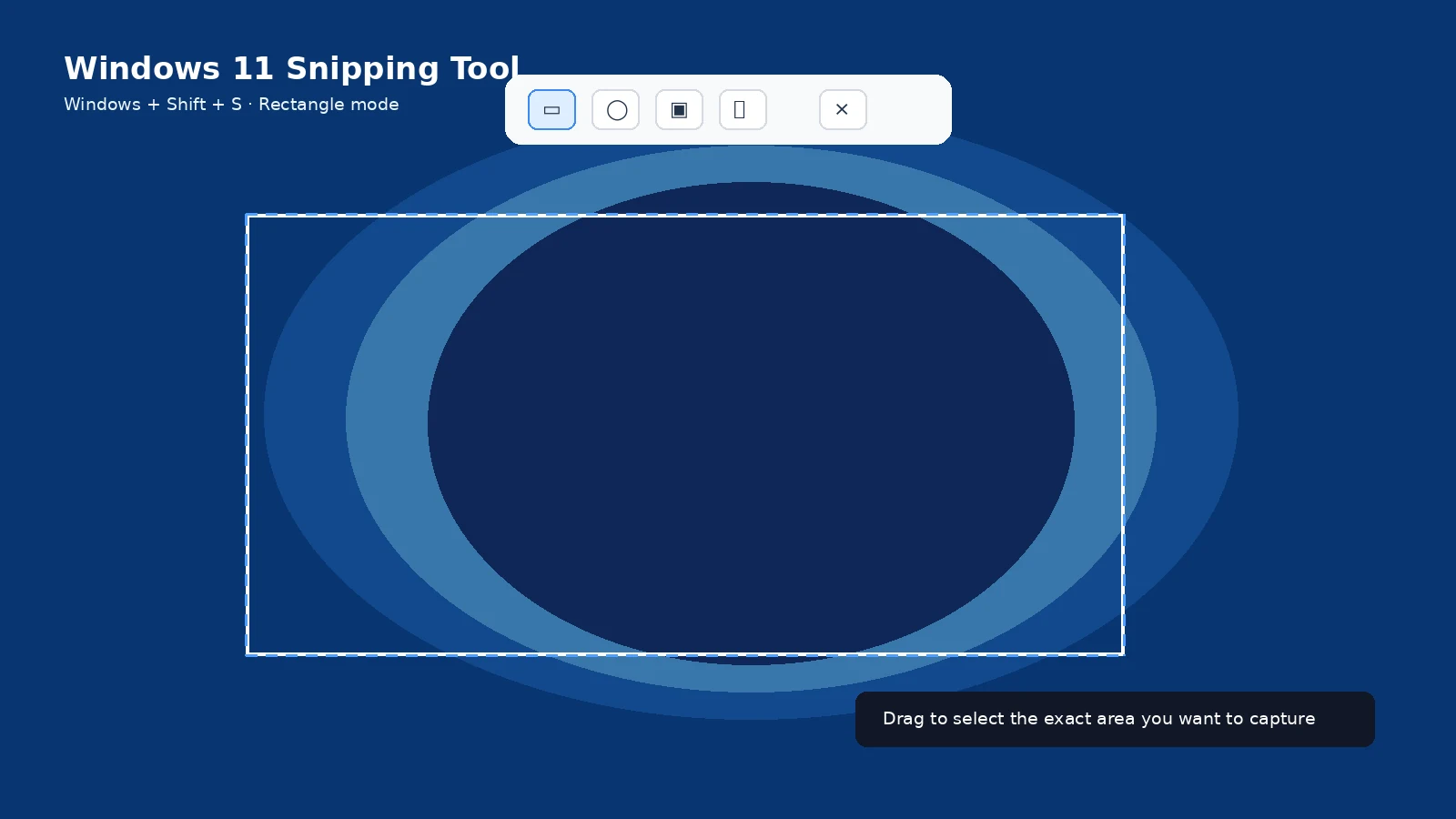
Choose a focal point
Decide what the viewer should notice first. Avoid marking every element on the screen.
Use consistent shapes
Use arrows for direction, rectangles for interface controls, and numbered markers for sequence. Keep the visual language consistent across a tutorial.
Keep text short
Labels should explain the action, not repeat a full paragraph. Put longer explanation in the surrounding article.
Redaction
Use solid opaque shapes or crop the image when privacy matters. Do not rely on a semi-transparent highlighter to hide passwords or personal data.
Preserve context
Leave enough surrounding interface visible that the viewer can recognize where the highlighted control lives.
Accessibility
Do not communicate the important instruction by color alone. Pair highlights with text labels or shapes and write useful alt text.
Troubleshooting
- If annotations cover the interface, reduce their size or move labels outside the target area.
Frequently asked questions
What color should annotations be?
Use high contrast against the screenshot and keep it consistent.
Should every screenshot have arrows?
No. Add them only when they reduce ambiguity.
How do I redact text?
Crop it or cover it with an opaque shape.
What should alt text describe?
The instructional meaning of the screenshot, not every decorative detail.